A psychedelic identity for Jamie Oliver’s pasta brand
The TV chef’s new home-delivery range has been brought to life with branding that emphasises the array of patterns found in pasta dishes
Otherway was enlisted to create the design identity for Pasta Dreams – a partnership between TV chef Jamie Oliver and Taster, a company comprised of food sub-brands which are all focused entirely on home delivery.
According to Otherway, the aim was to step away from what people might traditionally associate with Italian food, with an emphasis on retro design details.

The playful identity comes to life in a set of animations. Blobs of olive oil float through the air, and in the Pasta Dreams logotype, they rise up to form the counters in the letters A and R.
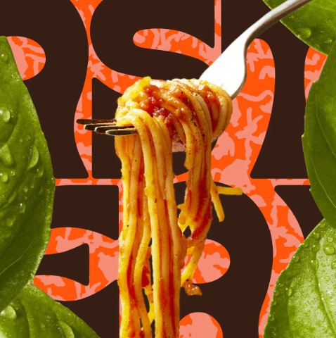
Meanwhile, towering strips of pasta rotate hypnotically on repeat alongside oversized ingredients, all arranged in a collaged visual.
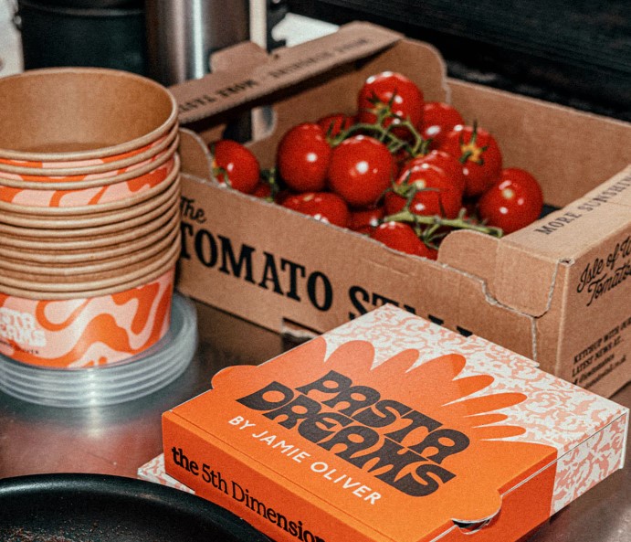
The psychedelic imagery carries through to the packaging, which highlights the “shapes, swirls, and splashes” people come across when cooking pasta and features a warm palette of peach, orange and brown.
The Pasta Dreams design concept seeks to appeal to younger customers rather than Oliver’s “traditional audience demographic”, yet there was an important balance to strike between unexpected and on-brand.

As Otherway founder Jono Holt told us earlier this year, in a piece about the shifting aesthetics of restaurants and food brands, a radically different design identity has to mesh with whoever is fronting it.
“We always say to people: at the end of the day, this is your brand! So it’s got to sit comfortably with you,” he said.
“Whether that’s the name or whether that’s the tone of voice and all that sort of stuff, don’t mismatch. If you’re not up for making noise and cutting through and being disruptive, then don’t design a brand that’s going to do that.”

Source: A psychedelic identity for Jamie Oliver’s pasta brand (creativereview.co.uk)
