UX design trends for 2022
X design is the pursuit of making things work, for everyone involved. UX design improves the experience for the user, making it smoother, seamless and positive. With new artificial and virtual realities shifting the way we work and socialize, there has been an increase in internet and technological device usage over the past two years. There are more users, more demands, more changing needs of users and a lot more feedback, making UX design one of the most dynamic design fields out there.
To give you an idea of what to expect in UX design in 2022, we asked our UX designer community about which trends are on their radar. What we found was an increase in attention towards experiences like storytelling, personalization and emotive interaction design that bring depth and reality to user experiences. There’s a lot more though. Take a look below at the top 8 UX design trends coming our way in 2022.
1. Storytelling
—
The fact that humans react to storytelling is not news. Stories have been with us since our existence, as evidenced by cave paintings, fairy tales, all the words and images that time travel seamlessly and join us together in common narratives. It’s a social activity that helps people relate to what’s being narrated. These stories and experiences are at their core emotive, they evoke curiosity and are immersive. Looking towards 2022, we see this timeless tool as a notable UX trend.

Web design by DSKY
Creating an experience through storytelling can build a strong connection between businesses and customers. The more a user knows the full story of a brand or the customer experience story, the more likely they are likely to trust and relate to the business.
All such details, or plot points, weave throughout the user experience, making it the user’s journey and story. That linear progression uncovers more, page by page, or with each scroll, new details unfold about why this brand came to be, what they are trying to do and how the user fits into the vision, product, or service.
2. Experimenting with navigation placement
—
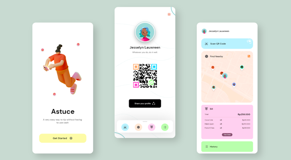
The placement of navigation on the screen and how users will reach them are two very important considerations in UX. And as mobile usage and screen sizes continue to grow, UX designers will have to come up with solutions for users to reach that navigation menu, usually sitting at the top. This year we will see UX designers playing around with navigation placement—moving the navigation or key buttons and items closer to the bottom of the screen, or some hybrid where the navigation is at the top but there are tab options for key pages at the bottom.

By Ilham Anugrah via Behance
For users, being able to find the navigation items is as important as being able to reach them with your thumb. For example, bottom placement can benefit users because the bar is easier to reach, but the downside is that it might cause confusion to find, or take some time to adjust. That’s why this upcoming year, we will start to see more experimentation with navigation placements. Only time will tell which method will rise victorious
3. Seamless experience
—
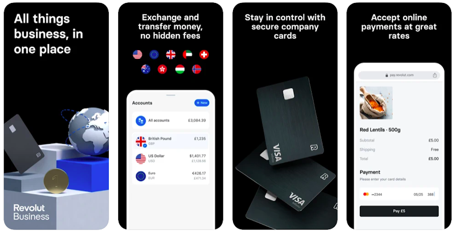
This UX trend is all about creating a user experience that flows smoothly from one step to another. To achieve a seamless experience, UX designers need to focus on creating continuity, whether that’s the continuity in a specific scene or process like making a payment, or the continuity of the higher, bigger picture like the complete customer journey from landing on the site, browsing the online shop, to making a purchase, to receiving the item.
It’s important that user experience is consistent and that each element within the given experience is a natural progression of one another. A smooth flow of experience means a positive experience for the user.

Revolut via App Store
We are already seeing a rise in this through super apps, an app that offers many services delivered through “mini-programs” or third-party integrations. The goal is to maintain the attention of a user for a longer period of time on your website or app, whether that’s endless feeds of videos, or social and e-commerce integrations.
For example, WeChat, which was initially a social platform, now includes a complete e-commerce experience within the app. Users can even order a taxi and apply for a loan through the app. Social platforms like Instagram, Facebook and Twitter have integrated ecommerce on their platforms already. Bank apps are making it easier to complete financial needs like budgeting, expense tracking, international transfers, payments and money management all in one place.
4. Voice user interface
—
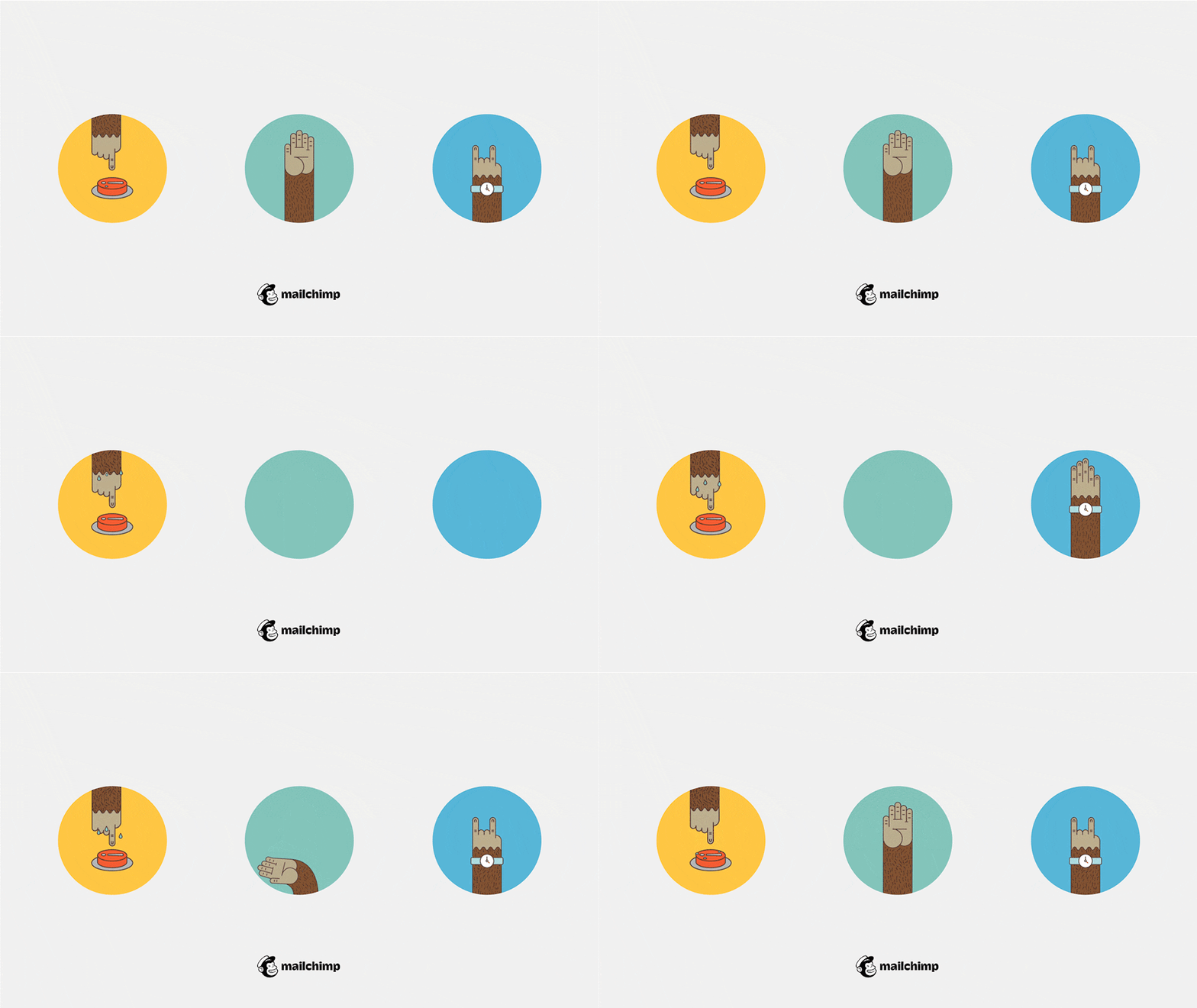
Voice assistance (creating great user experiences through voice control) isn’t a new UX trend by any means. What’s new is how it’s taking shape today. Originally, UX design for voice interfaces was screen-first, meaning that our first and main point of contact was the screen. That’s why, voice user interfaces can fall short, by being glitchy, failing to integrate with the app, or incurring delays of when a person should speak, to name a few.

By Alex Leshan via Behance
Lately, there is more importance placed on voice interfaces and more use of voice programs, and therefore, more need in creating a smooth experience between the user and the voice application or software. That’s why there is a need to make sure that experience is thought of, not necessarily just from a screen-first approach, but voice-first or at the very least a hybrid of the two.
5. Personalized experience
—
Personalizing user experience is a trend that’s not going away any time soon. With the abundance of content that users can access on the web, more and more apps and websites personalize the experience to each individual user, whether that’s providing personalized suggestions or meeting accessibility guidelines. The goal for the UX designer is to create a design and product that closes the gap between what any user expects or wants and what they experience.
Personalization tends to focus on things like localization (recommending things based on where a user is located), demographics (statistical data like age, sex, education, nationality, ethnicity, or religion, to name a few) and behavioral data (data gathered from the user’s behavior on the website or app). With that information, UX designers will then create an experience and journey that is personalized to what users expect, need, or want.

By Nagen
6. Creative scrolling experiences
—
Scrolling is an experience on its own, and it’s getting more and more imaginative. This UX trend focuses on the journey of uncovering more and more bits of a website by scrolling. Elements in the background change, elements move through the page with the users, or users that are immersed in the experience of what the website has to offer.
7. Emotive interaction design
—
Emotive interaction design, or emotional design, is all about creating experiences that bring up an emotional response in users. Through these experiences, users build a deeper connection to the website or app and have an overall more positive and memorable interaction. They follow the journey with the user and provide encouragement and support.

Animations and other effects create experiences that are resemblant to human interactions. For example, Duolingo uses characters that congratulate a user when they do well, give them awards, or support them when they can’t complete a challenge. The experience becomes associated with emotions like excitement.
8. Data visualization
—
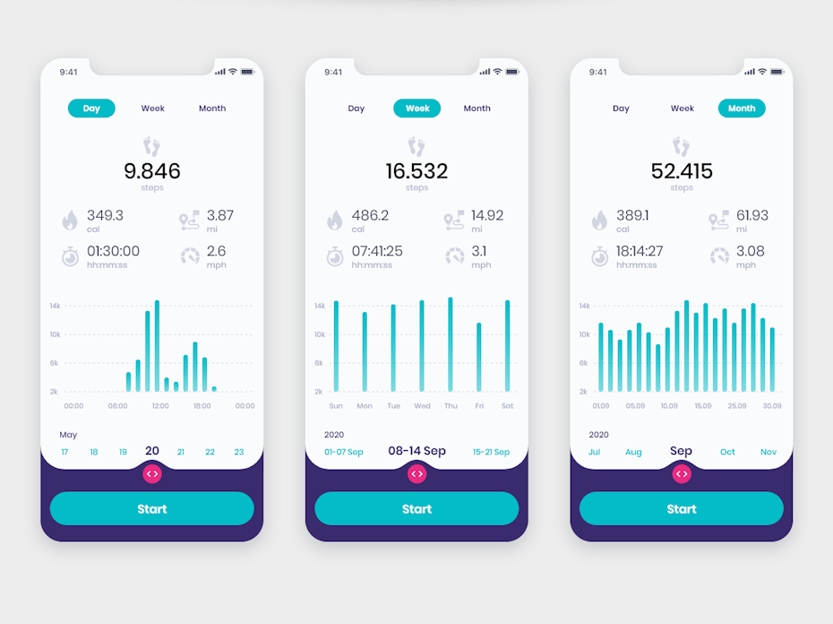
Visualization of data is an absolute, essential part of some experiences but if not done right, it can be rather cryptic and overwhelming. The data visualization UX design trend explores ways in which this experience can become visually pleasing, easily digestible and more exciting. Some of the obvious ways of doing this in UX design are through bar charts, line charts and pie charts, and using bright and vibrant colors.

By boryszbn
Allowing users to expand and explore using features like swiping or tapping, helps create engagement with the data. When done well, these practices can achieve a good balance of information a user might need from big picture to more detailed information. A balance of contrasting colors and accessible data and information creates a positive and engaging experience for all users. After all, you wouldn’t want to overwhelm users with data or make them feel like they don’t understand, that’s a sure way to lose users.
