Guide to Web Typography
Typography for the Web has come a long way since Tim Berners-Lee flipped the switch in 1991. Back in the days of IE 1.0, good web typography was something of an oxymoron. Today things are different. Not only do we have browsers that support images (gasp!), but we have the opportunity to make our web pages come to life through great typography.
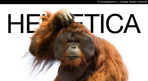
First, it’s worth noting that Typography is not just about choosing a font, or even distinguishing one typeface from another. In recent experiments, trained monkeys were able to correctly identify Helvetica 90% of the time.

Today we’re going to talk about web typography in terms of a recipe of four fundamental ingredients. If you’ve ever tried to cook a soufflé, you’ll know how important the recipe is. Follow this recipe and your typography will rise up like … that’s enough of the culinary metaphors, let’s cook:
Contrast
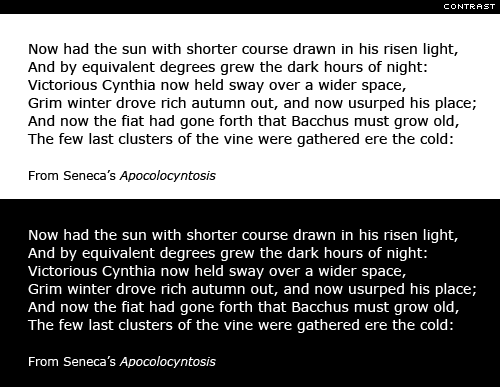
Pale pink text on a pale blue background, might match your t-shirt, but it just doesn’t read well. Text exists to be read; make sure that it contrasts enough with the background to achieve that. If you’re ever unsure about contrast, then take a screen dump of your page, open up your image editing software and reduce the image to grey-scale. You’ll soon see if you have enough contrast. Robert Bringhurst, the consummate typographer writes, typography exists to honor content. Are we honouring the content, if we design our pages in such a way that the text, the content, is difficult to read?

Personally I dislike reading long stretches of reversed out text (i.e. light text on a dark background); how often do we see books set like this? It may well be appropriate for shorter stretches of text on-screen, but I find it very tiring to read for any length of time.
Size
With the birth of Web 2.0 I noticed a rather annoying trend; namely small type. I’ve even emailed site authors and kindly suggested that they increase the default font size. I’ve received mixed replies from, tough, get yourself some glasses to thanks, I’d never even considered that my type might be too small for the average reader. I’ve even heard tiny body text defended with, “it matches my minimalist design”, or similar. It most likely reflects a small something else. Unless Super Man and 20/20 Vision Girl (Marvel Comics, keep your hands off, she’s mine) are your only readers, then small type is just not on.

Don’t set body text below 10 or 12px and, if possible, make it bigger. Remember, what’s legible on your 65 inch High Definition Plasma monitor, might not be so on a 15 inch MacBook. If in doubt, make it bigger. The body text on ILT is set at 16px.
Hierarchy
Varying type size is one of the best ways to differentiate content. Colours and pretty boxes might help, but different sizes of type, used consistently throughout your pages, will signal loud and clear to your readers the relative importance of your pages’ elements. It also means that if your readers are in a hurry, they can quickly pick out the important bits — and that could mean that they stay longer and read on

Hierarchy can be achieved in other ways too. We’ve just mentioned using different sizes of type to achieve it, but we can also use different styles; for example, all-caps, or using italic for sub-headings. Serif and sans serif faces can also be mixed to good effect.
Space
Let your type breathe. Don’t be afraid to leave blank spaces in your pages. This negative or white space will help focus attention on the text–and it’s the text that speaks loudest, so let it be heard. Next, remember the line-height CSS property; a good rule of thumb is line-spacing that’s at least 140% of your text size (remember, I’m writing about web typography here). Good type designers put a whole lot of effort into the micro white space that sits inside type. They spend countless hours attempting to achieve a balance between the black of the type and negative or white space that it envelops. Likewise, we should take time to consider the macro white space, the ‘voids’ that shape our blocks of text.

Remember, these are not rules, but rather guidelines. However, follow them–contrast, size, hierarchy, and space–and your typography will rise like one of Gordon Ramsay’s Soufflés. Oh, and I was only kidding about the monkeys.
In a future three-part series on the fundamentals of typography, I’ll look at all of the above in more detail. I’ll also be discussing numerous things (details) that will go a long way to improving your typography both on- and off-screen.
Source:I love Typography (ILT)
