UX/UI Design Trends 2021
Users visit tons of websites every day, and businesses have to show extra creativity to draw their attention. Entrepreneurs focus on the visual appeal and usability of their web solutions to make users stay there. Also, they keep an eye on the latest UI trends to stay in the game.
Let’s now explore the leading UI/UX design trends of 2021 in detail and see how popular brands successfully implement them
1. Minimalism
Minimalism stands proudly among the latest UI trends and is not going to lose ground. Every day people come across various advertisements. They see discount ads and get constant notifications. Also, consumers interact with different interfaces that are overwhelmed with information.
To avoid such overload, web designers are always searching for new ways to make graphic elements simpler. They limit the number of colors, try different proportions and compositions.
Today the functionality of elements plays a paramount role. It is crucial to highlight the best qualities of a product properly and convey the right emotions from its usage to customers. Components that designers use for decorative purposes only become irrelevant.
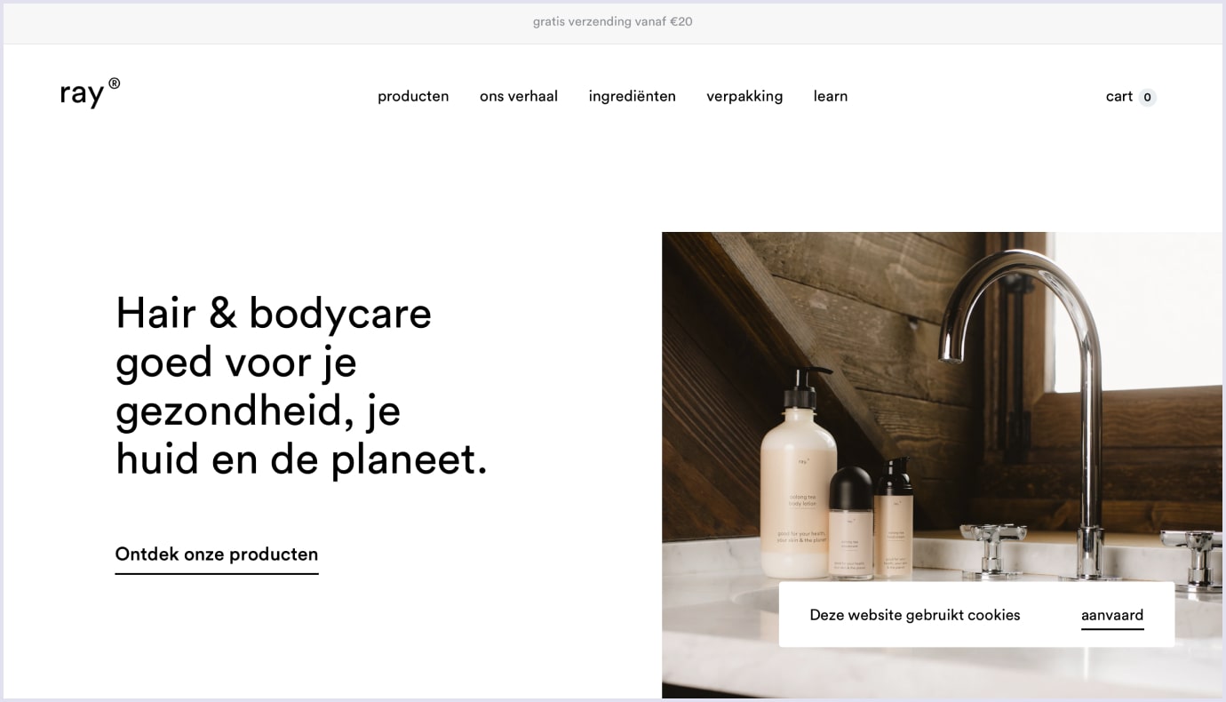
A hair and body care brand Ray created a simple and elegant web design using this user interface trend.
2. Simplified UX
In 2021, you should not complicate interfaces and force users to take extra actions. Try to minimize the number of elements and fields that customers should fill out.
Simplified registration and signing in became one of the latest UX trends. For example, when logging in to their marketplace account, users can enter their phone number. They no longer need to remember another password.
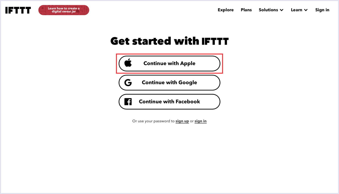
Thus, Apple followed this recent UX trend and made a custom button that helps avoid extra registration steps. By clicking the button, you choose whether you want a website to see your e-mail or not. One moment and you are already logged in.
3. Blurred, colorful background
The trend with different styles of using gradients was popular in the past and remains a relevant UI trend to this day.
Now gradients are becoming lighter, but at the same time, they look much more complex. The thing is that earlier, designers used about 2-3 colors in linear gradients. Now the number of colors can be increased up to 10. In addition, an overlay can be used.
Such gradients cause a temperamental outburst because they are so colorful. That is why designers from many famous companies such as Stripe or MyMind enjoy using them.
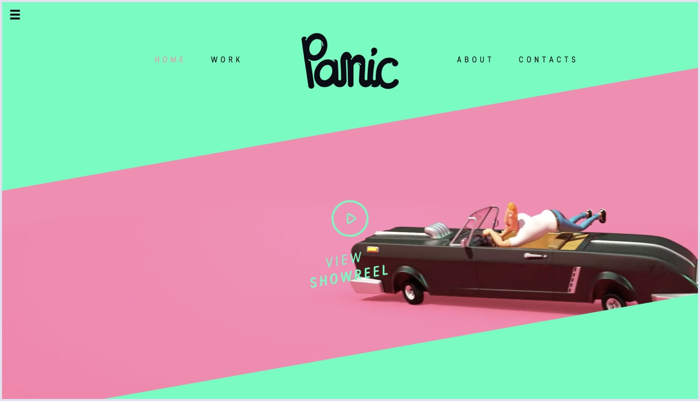
A financial services and software as a service (SaaS) company Stripe also knows how to implement one of the latest UI trends successfully. On their website, we can see an example of a complex blurred background that consists of several colors.
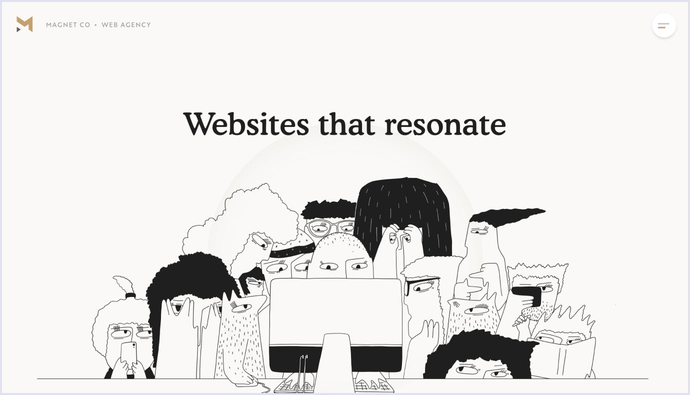
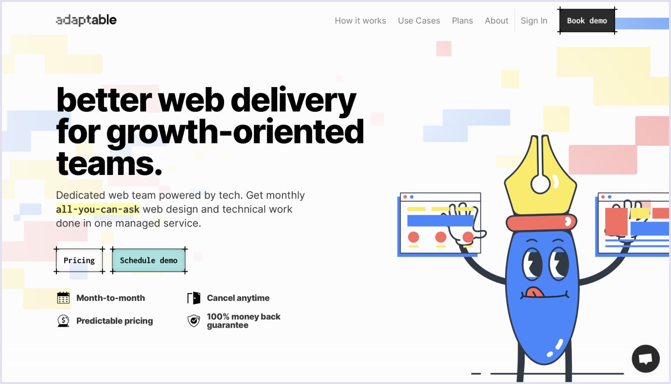
4. Unique and absurd 2D illustrations
Illustrations stay on the top of user interface trends like they did last year. However, they are less generic than before.
Earlier, web designers adhered to minimalism when it came to illustrations. This way, they tried to make web pages less overloaded and more comprehensible for users.
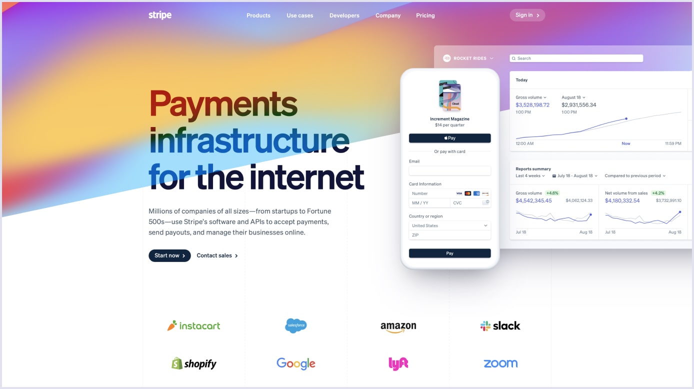
These days designers are experimenting with unusual angles, proportions, and storylines. They are using bright or, vice versa, muted pastel colors. The illustrations are getting fancier and cause an even bigger stir than ever before.
We suggest that you use the SVG format for your illustrations. The quality of images in PNG, GIF, and JPEG formats is getting worse when screen resolution is increased. It is not a problem with SVG since the vector format can be increased and decreased with no loss in quality.
A web agency Magnet Co knows how to give their website a distinctive look with the help of absurd and unique illustrations.
Another stunning example of this user interface trend is demonstrated by a tech company Adaptable.
5. Voice User Interface (VUI)
Interaction with voice user interfaces has become one of the UX trends again as a result of its widespread adoption in UX/UI design. It has long been clear that the design does not have to be visual to work fine.
The voice interface is an internal interface. It has more to do with context and data synthesis than with actual design. Nevertheless, designers are trying to keep pace with the latest user experience trends and provide users with a voice interface more and more often.
For example, today we can see dozens of apps where you can translate a word or sentence into any other language. It works the following way. You click a button, and the device starts recording your voice and translating your speech. This way, you can easily communicate with people who do not know your language.
Google Translate shows how to implement this current UX design trend properly.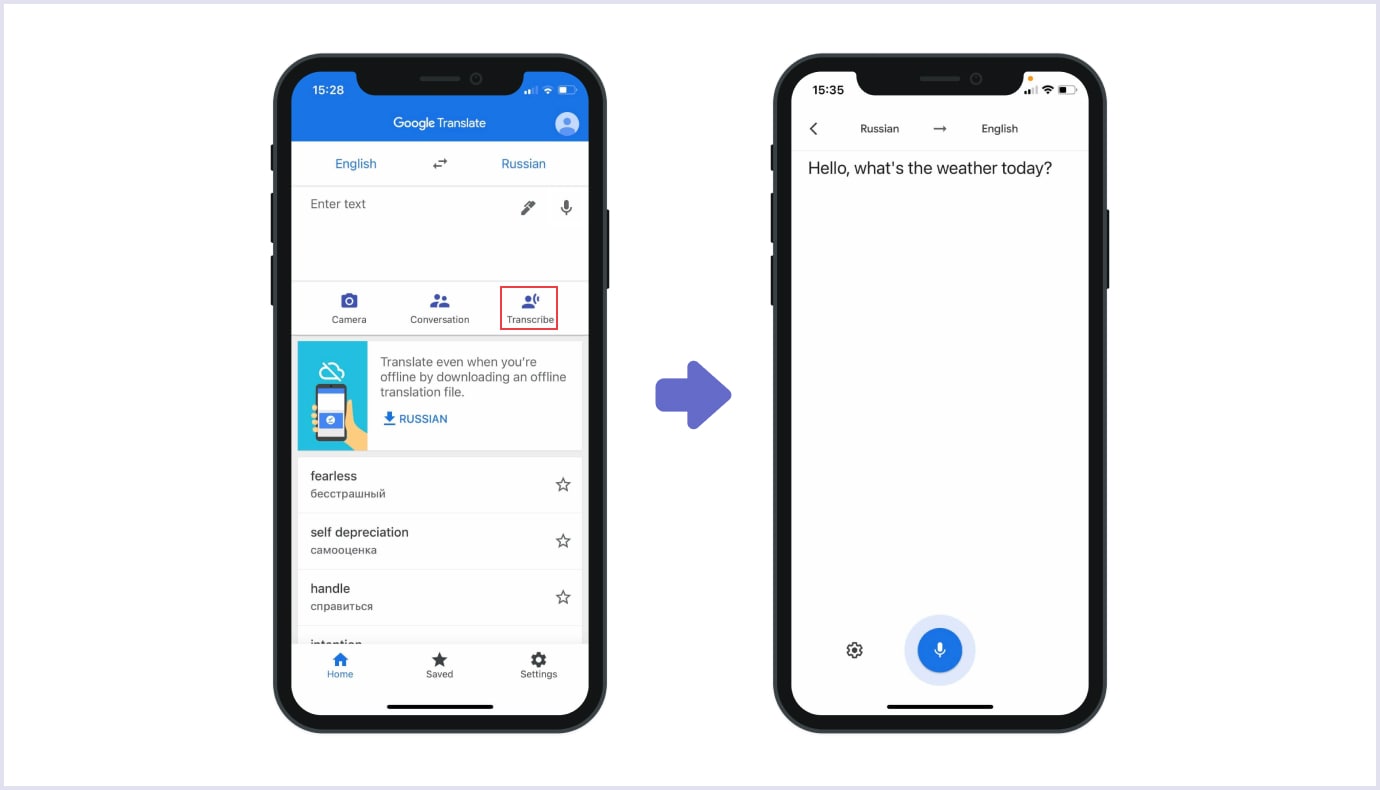
6. Pastel colors
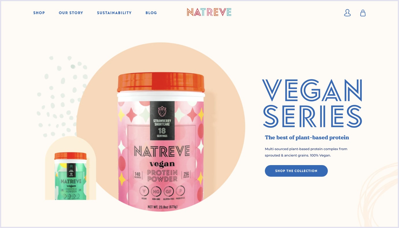
Since today is the day of minimalism and simple web design, designers tend to use pastel colors in their works. This way, they highlight the lightness and unobtrusiveness of the design.
Such colors fit into various concepts very well. They set the right tone and atmosphere for different websites, for example, e-commerce platforms, or SaaS applications.
Natreve built a flawless example of using pastel colors on their website.
Ayakaito brand knows how to give their website an elegant look by following the latest UI trends.

7. Mobile-first approach
Today, nearly half of search queries come from mobile devices. People use their smartphones to search a cafe to have dinner or order movie tickets, browse travel marketplaces to book a holiday trip, and so on.
These days web design should look good not only on the desktop version of your website or app. For this reason, the mobile-first approach became a significant UX trend. Web designers find it a great way to improve customer interaction.
At Codica, we develop PWA applications for each project. We convert websites into convenient cross-platform applications. Users can download them right from the website page to the home screen of your device.
Find a minute to learn more about the PWA for insurance startup that has been recently added to our case studies.
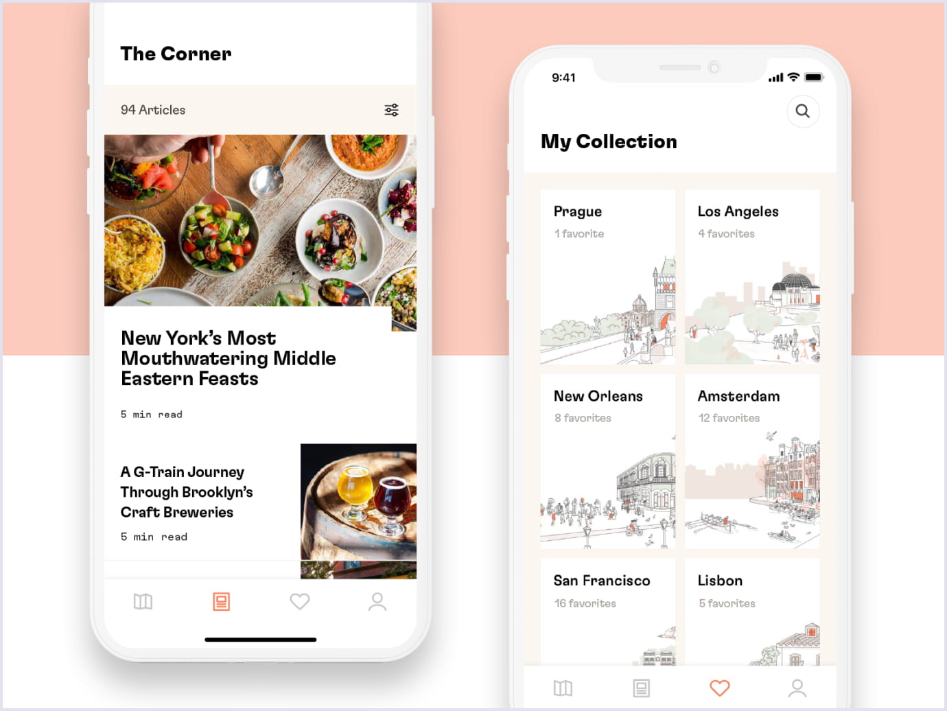
Developers of Dorsia know perfectly well how to implement this latest UX trends in their travel app:
8. Icons
Icons serve as an efficient tool for visual communication with customers. Simple minimalistic icons are considered a powerful UX trend. It is all about their ability to convey meaning in less space than words.
For this reason, many businesses play special emphasis on icons. For example, In 2020, such big companies as Apple and Sketch followed the latest user experience trends and made a complete redesign of all their system icons.
We recommend choosing icons from the same family. They should have the same size and dimension. Such consistency will show your skill level and emphasize the integrity of your website.
The perfect implementation of this UX trend we can find on the website of Vedran Badun Adventures.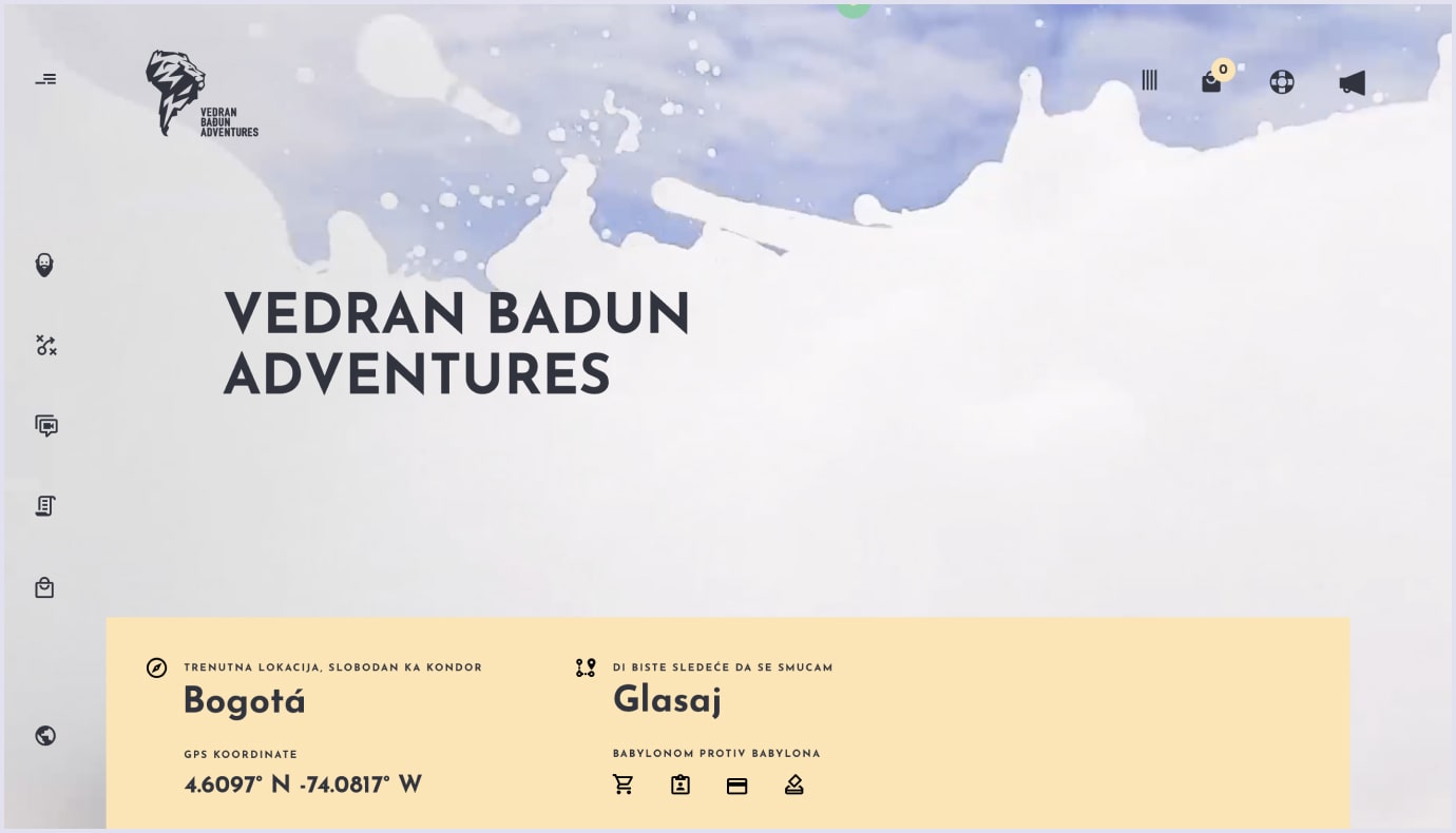
9. Onboarding
Onboarding is a short introduction to the product that helps you get insight into an application. Also, it makes it easier to understand its key functions. Whatever the case, onboarding became a prominent UX trend that should not be ignored.
There exists an opinion that onboarding is a sign of bad design. They say that if you need to explain how the product works, then something is seriously wrong with its design or description. Besides, you force users to go through these screens and take unnecessary actions.
In reality, modern onboarding contains the most important screens of mobile applications. Owing to them, users get a better idea of what this app can do.
We recommend that you keep onboarding simple. Pay attention to the text, make it concise and easy to read. Use beautiful high-resolution illustrations and photos. You need to explain the value of your product and use all this information to create interesting content.
Here’s a great example of the current UX design trend implemented by Unibank.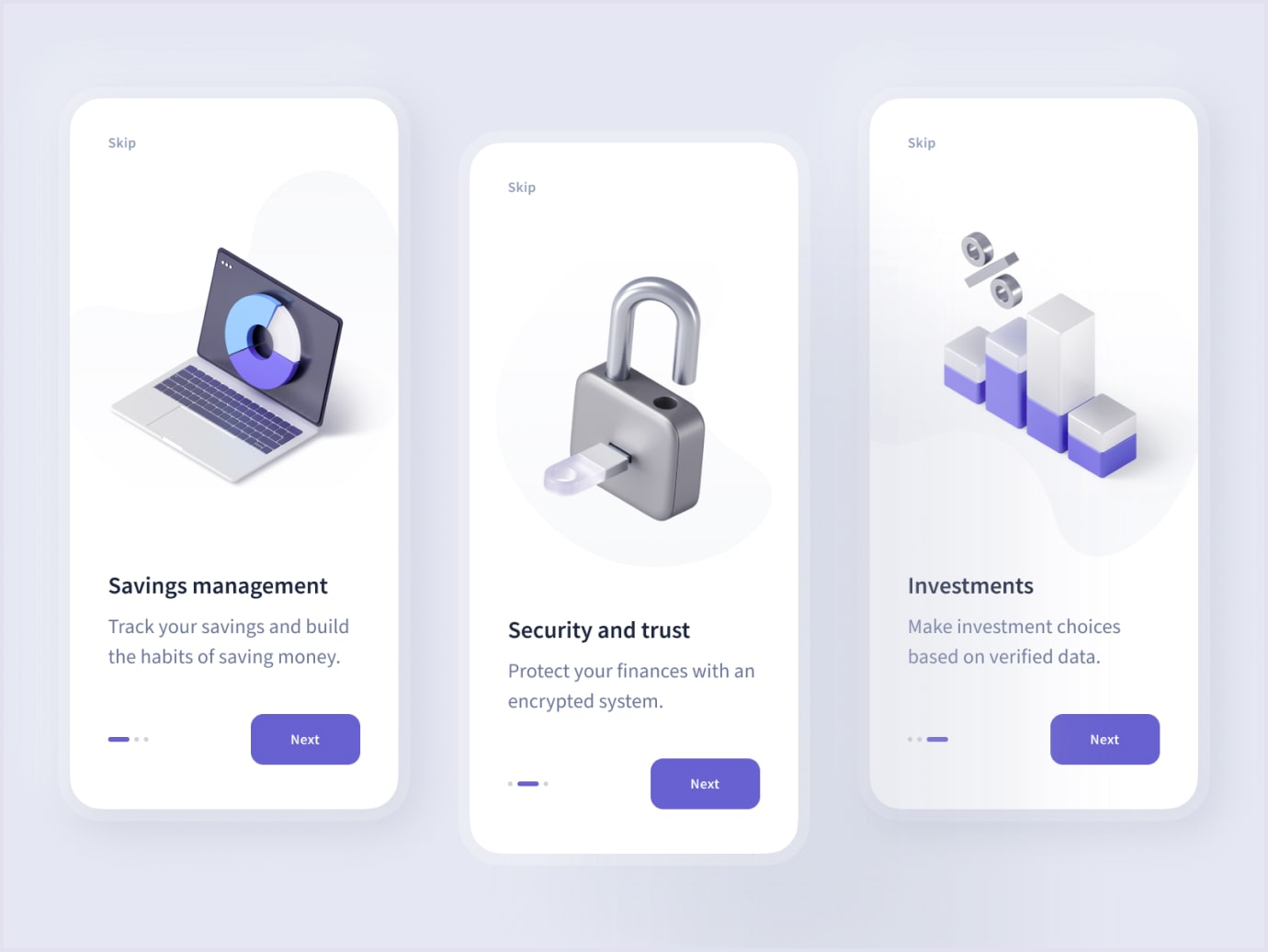
10. Glassmorphism
Last year neomorphism was widely used in web design practices. It represents a combination of two common approaches to creating user-interfaces. They are called skeuomorphism and flat design. These UI trends differ significantly from each other and often considered the exact opposites.
In 2021, web designers got a new passion which is called glassmorphism. This trend comes from the blur effect or so-called blurred background. When people look at such an element, it seems that they are looking through the glass.
Below you can see how a Yacht Booking Service Application looks stylish with the help of the glassmorhism web design trend.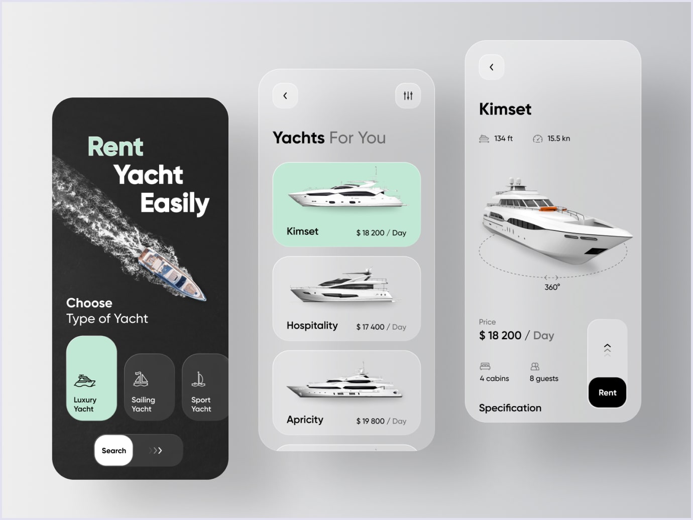
11. Complex typography
Every designer knows how important it is to choose the right font for a website, product, or application. Customers often associate a particular font with some big brand. Nobody would use Roboto if it wasn’t for Google. The Internet giant created this front and showed it to the whole world.
People do not like to read on the internet, they scan. In such a way, they find information that is important for them. For this reason, experiments with fonts became one of the remarkable UI design trends. Today web designers use complex typography They try to highlight the most important information and convey it to customers.
These days we can often see websites that are entirely built on typography. They look very fresh and entertaining.
Speaking about fonts in general, their combination is an important part of the design for any web solution. Check out the UI guidelines created by Codica team for an online collaboration marketplace.
Let’s take a look at how complex typography was implemented on the portfolio website of a wedding photographer Naba Zabih
Another great example of this UI trend we can see on the website of a creative developer Sam Goddard.
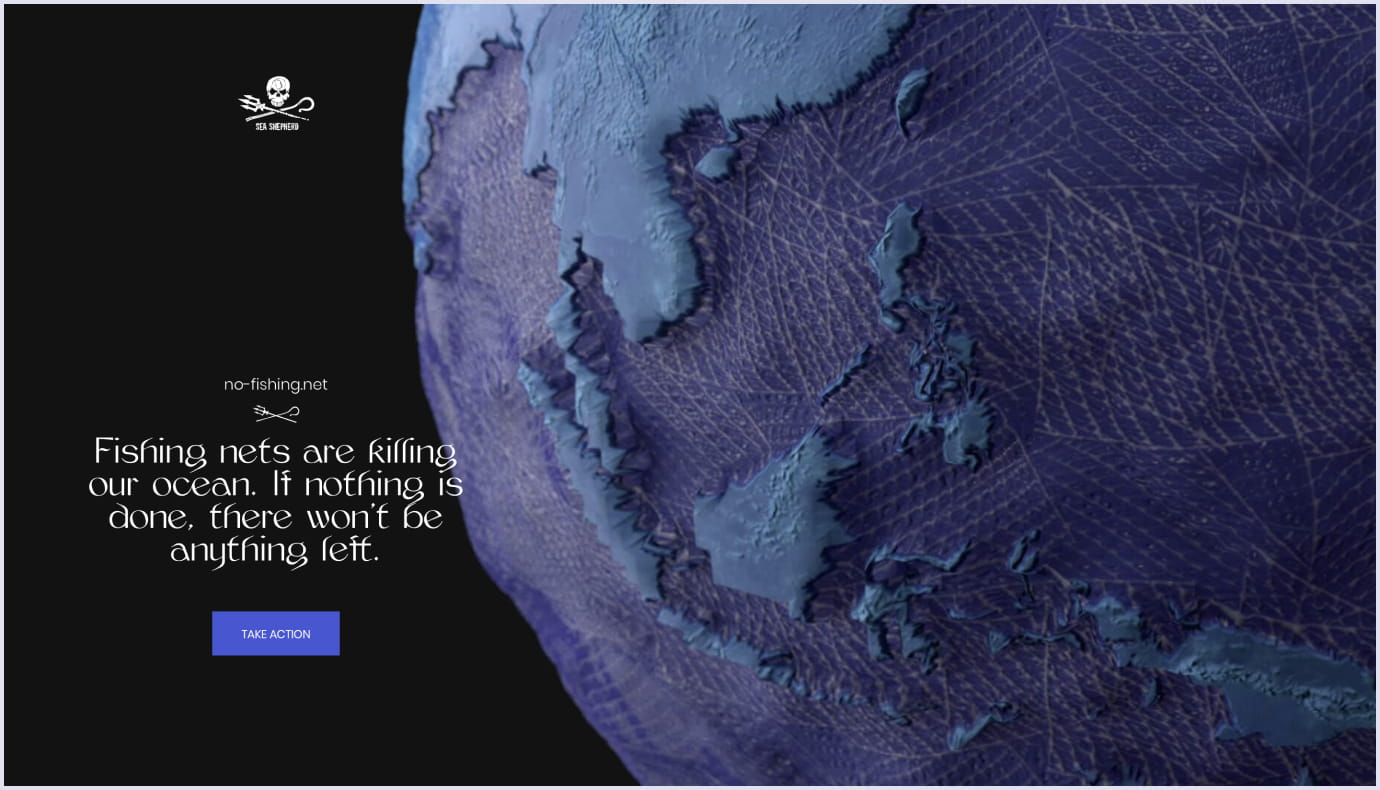
12. Immersive 3D visuals
The world does not stand still. The 3D design area has been developing rapidly. However, the main drawbacks of this technology did not go anywhere. The more complex the 3D graphic is, the more load it puts on users’ computers.
In 2021, 3D elements will become even more popular, owing to the high demand for AR and VR technologies. For example, in a new update from Apple, macOS Big Sur, a number of icons were changed. Designers added the elements of three-dimensional graphics to some of them.
Below you can see how this UI trend was successfully implemented by Loftgarden.

Immense 3D visuals lend credence to the website of the awareness campaign No fishing. net.
In 2021, design trends are a mix of minimalism, simplified UX, pastel colors, complex typography, and immersive 3D visuals. To succeed in creating a unique and engaging user interface, try to choose and combine several tendencies.
Source: codica.com
