
Importance of Knowing Color Psychology in Graphic Design
Why is Color important? Whether working on a logo, an advertisement, a branding campaign or just a simple business card, the colors your choose are equally as important as the information you include. In design, it is crucial to have a firm understanding on how color will effect the average consumer.
Color in design is very subjective. What evokes one reaction in one person may evoke a very different reaction in somone else. Sometimes this is due to personal preference, and other times due to cultural background. Color theory is a science in itself. Studying how colors affect different people, either individually or as a group, is something some people build their careers on. And there’s a lot to it. Something as simple as changing the exact hue or saturation of a color can evoke a completely different feeling. Cultural differences mean that something that’s happy and uplifting in one country can be depressing in another.
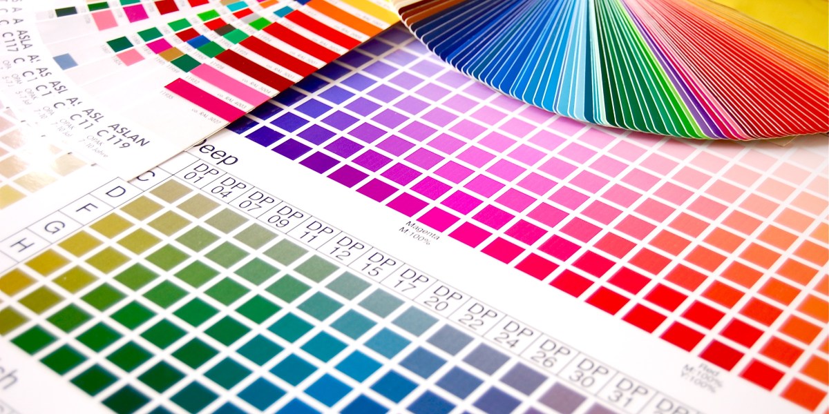
Color is a powerful tool in graphic design. It can be used to attract attention, organize content, emphasize elements, evoke emotion and help a design look aesthetically pleasing. But what colors should be used? In order to choose the right colors and color combinations, it is important that the graphic designer have a basic understanding of color theory. Color theory is the study of color in art and design, their relationships with each other and principles used to create harmonious color schemes.
Primary Colors
Primary colors are red, blue and yellow. These three colors are the most basic colors on the color wheel. They cannot be made from any other colors but all other colors on the color wheel are made from them. They are commonly used together to attract attention, such as children’s products or at a circus.
Secondary Colors
Secondary colors are green, orange and purple. They are formed by mixing equal amounts of the two primary colors that are beside them on the color wheel. For example, green is made from mixing blue and yellow. They can be used together to create a nicely balanced color scheme.
Tertiary Colors
Tertiary colors are blue-green, yellow-green, yellow-orange, red-orange, red-purple and blue-purple. They are formed by mixing a primary color and a secondary color together. For example, as the name implies, blue-green is made from mixing blue and green. Tertiary colors help create a wider color palette.
Color Terminology
-Hue refers to the color name.
-Value is the lightness or darkness of a hue, ranging from white to black on the value scale.
-A tint is made when you add white to a hue. A shade is made when you add black to a hue.
-Intensity (chroma) is the brightness or dullness of a color.
Color Harmony
Colors can be combined in various ways, but the three most common color harmonies are monochromatic, analogous and complementary.
-Monochromatic harmony is developed around one hue. This could mean variations in value or intensity of one hue, such as light, medium and dark blue. Monochromatic schemes are easy and restful, but can sometimes become monotonous. Monochromatic colors are colors with variations in tint and shade. Although there is very little variety in these colors, they can be used to create a simple, clean and elegant color scheme with minimum contrast.
-Analogous harmony refers to choosing colors that are close to each other on the color wheel. An example is yellow, yellow-green and green. This produces a restful effect and is less dramatic than the complementary color scheme. This color scheme is similar to monochromatic colors but with more range. They have low contrast but work well together because they have common undertones.
-Complementary harmonies are colors that are opposite each other on the color wheel. They tend to be dramatic, such as the red and green Christmas color scheme. Complementary colors intensify each other and tend to be bold and attention- getting. They provide maximum color contrast and work particularly well when a warm color is paired with a cool color. Using complementary colors is an important aspect of creating aesthetically pleasing art and graphic design.
-Another way of combining colors is through the use of value. Value, the lightness or darkness of a color is a great harmonizing factor in your color choices. Different colors have different inherent values.
Color Temperature
Psychologists divide hues by those associated with warmth and coolness. Warm hues include the yellows, oranges and reds. These hues accelerate the pulse, increase body temperature, and indicate an extroverted emotional response. Cool hues include the blues and violets, and are perceived as receding, tranquil, and passive.
Colors often have different meanings in various cultures.
Black
Black is the color of authority and power. It is popular in fashion because it makes people appear thinner. It is also stylish and timeless. Black also implies submission. Priests wear black to signify submission to God. Some fashion experts say a woman wearing black implies submission to men. Black outfits can also be overpowering, or make the wearer seem aloof or evil. Villains, such as Dracula, often wear black.
White
Brides wear white to symbolize innocence and purity. White reflects light and is considered a summer color. White is popular in decorating and in fashion because it is light, neutral, and goes with everything. However, white shows dirt and is therefore more difficult to keep clean than other colors. Doctors and nurses wear white to imply sterility.
Red
The most emotionally intense color, red stimulates a faster heartbeat and breathing. It is also the color of love. Red clothing gets noticed and makes the wearer appear heavier. Since it is an extreme color, red clothing might not help people in negotiations or confrontations. Red cars are popular targets for thieves. In decorating, red is usually used as an accent. Decorators say that red furniture should be perfect since it will attract attention.
The most romantic color, pink, is more tranquilizing. Sports teams sometimes paint the locker rooms used by opposing teams bright pink so their opponents will lose energy.
Blue
The color of the sky and the ocean, blue is one of the most popular colors. It causes the opposite reaction as red. Peaceful, tranquil blue causes the body to produce calming chemicals, so it is often used in bedrooms. Blue can also be cold and depressing. Fashion consultants recommend wearing blue to job interviews because it symbolizes loyalty. People are more productive in blue rooms. Studies show weightlifters are able to handle heavier weights in blue gyms.
Green
Currently the most popular decorating color, green symbolizes nature. It is the easiest color on the eye and can improve vision. It is a calming, refreshing color. People waiting to appear on TV sit in “green rooms” to relax. Hospitals often use green because it relaxes patients. Brides in the Middle Ages wore green to symbolize fertility. Dark green is masculine, conservative, and implies wealth. However, seamstresses often refuse to use green thread on the eve of a fashion show for fear it will bring bad luck.
Yellow
Cheerful sunny yellow is an attention getter. While it is considered an optimistic color, people lose their tempers more often in yellow rooms, and babies will cry more. It is the most difficult color for the eye to take in, so it can be overpowering if overused. Yellow enhances concentration, hence its use for legal pads. It also speeds metabolism.
Purple
The color of royalty, purple connotes luxury, wealth, and sophistication. It is also feminine and romantic. However, because it is rare in nature, purple can appear artificial.
Brown
Solid, reliable brown is the color of earth and is abundant in nature. Light brown implies genuineness while dark brown is similar to wood or leather. Brown can also be sad and wistful. Men are more apt to say brown is one of their favorite colors.
Copyright © 2021 Dotugo | Creative Design Agency – Jakarta, Indonesia